UX/Product Design
Young Life Responsive Giving Form
Young Life Responsive Giving Form
The Story
Young Life is a Christian ministry that reaches out to middle school, high school and college-aged kids in all 50 of the United States as well as more than 90 countries around the world. They believe that kids' lives are dramatically impacted when caring adults come alongside them, and they begin to see that their lives have great worth, meaning and purpose.
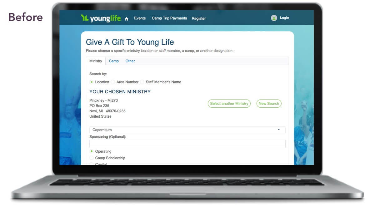
Young Life benefits greatly from the generosity of individuals and companies who give to their organization. They needed a way to optimize their most-used path to giving: the form on their website. They have an existing Salesforce platform, but were not taking advantage of all the benefits. Optimizing the backend integration, and improving the user experience of this form, would make it easier for donors to give and easier for Young Life to track metrics and leverage their already strong social media presence.
The Ask
Initially we were focused on designing a Salesforce Community to meet Young Life's goal of increasing membership and community engagement. This would include improved profile and communication features, privacy settings, volunteer/participant/donation history, and more. Further discovery revealed that the top priority was actually to improve the online Giving Form and provide an opportunity for donors to register as members.
We set to work on the Giving Form, but later learned that we still needed to make improvements to the Community if we were to use that to motivate donors to create an account. That proof of concept can be viewed here.
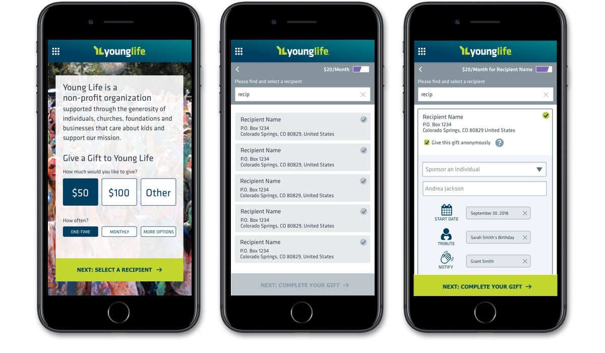
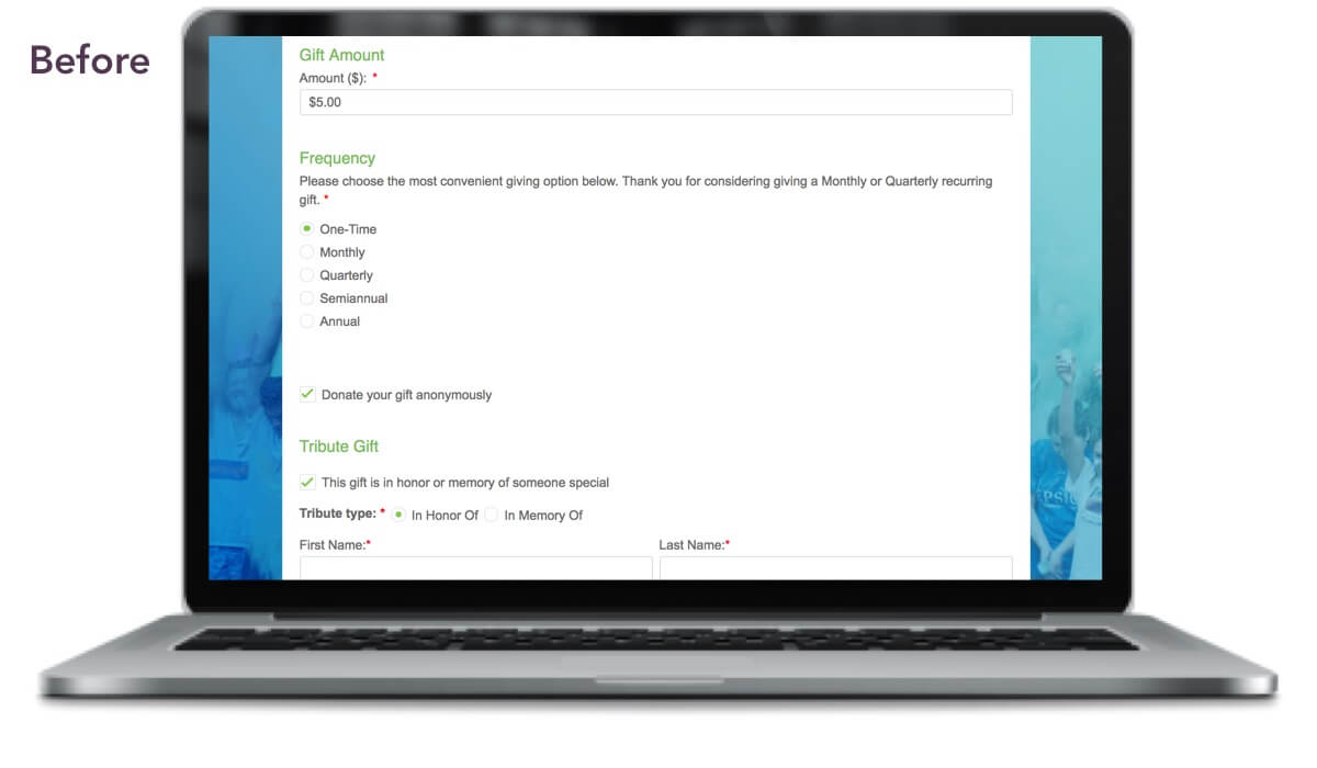
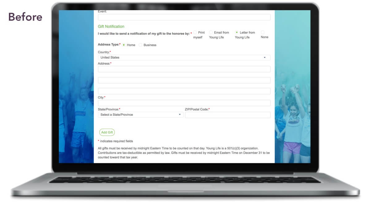
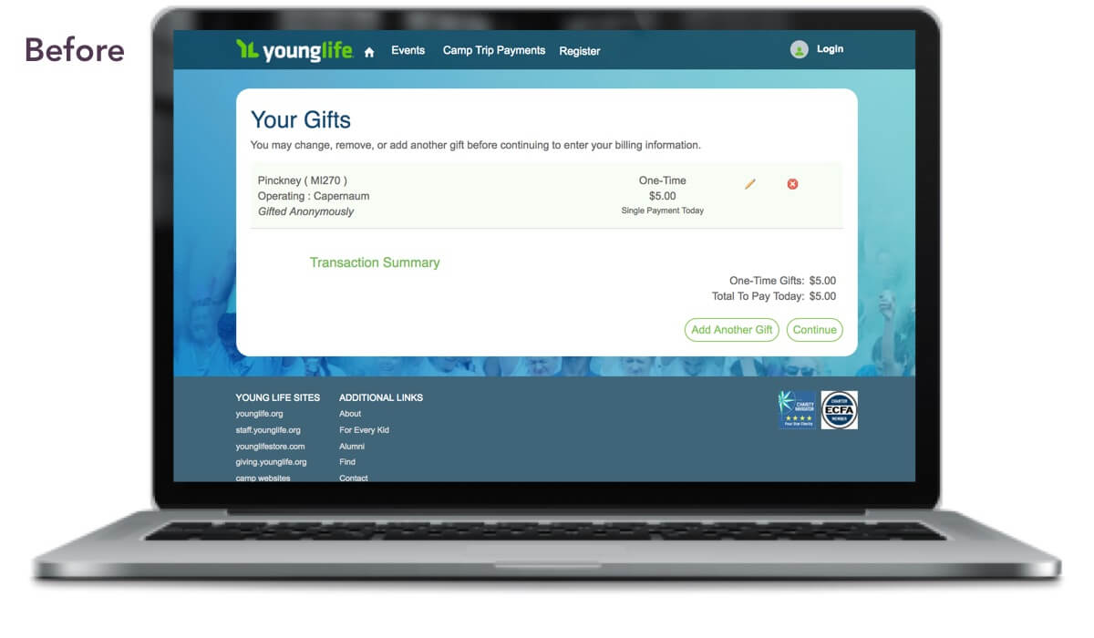
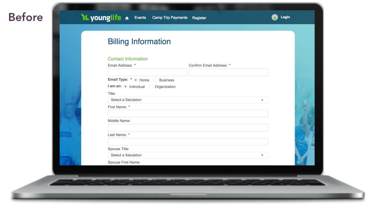
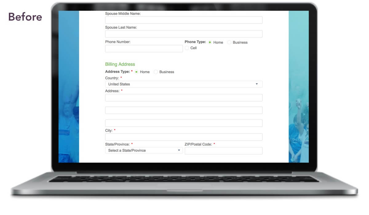
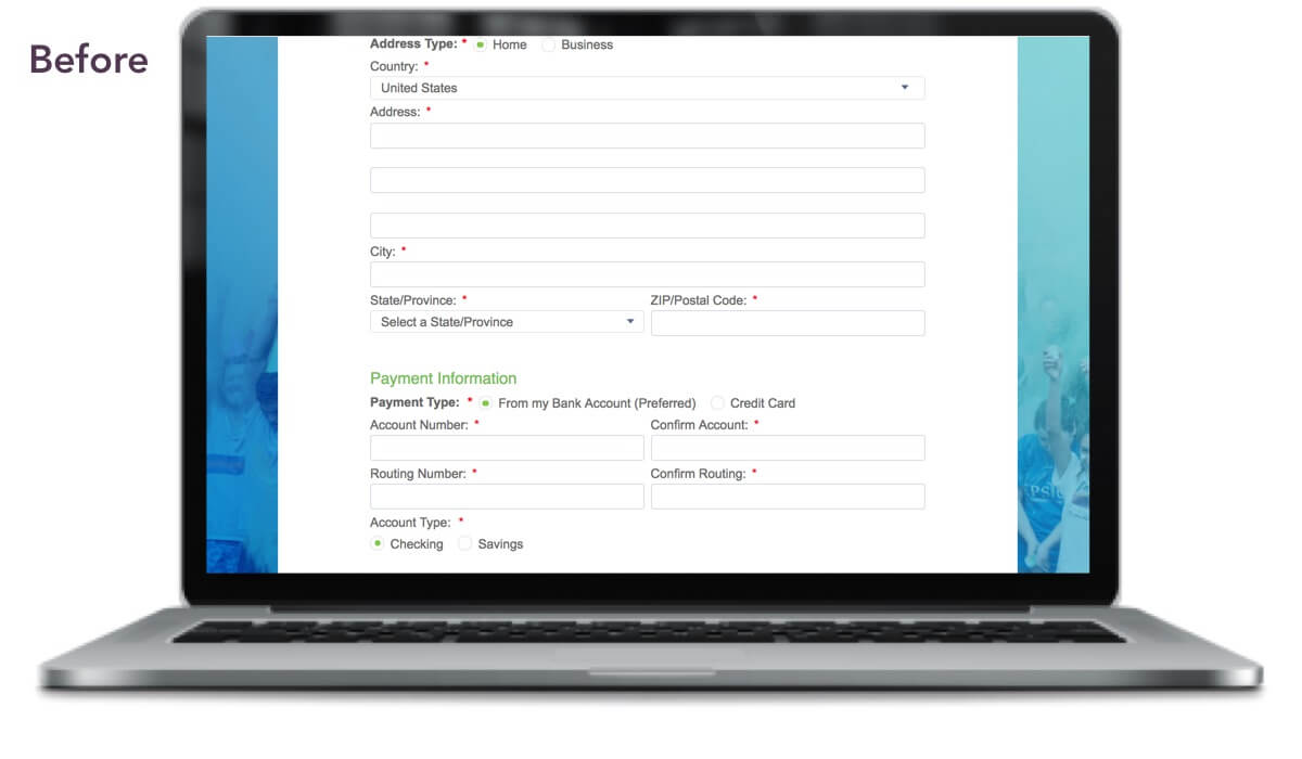
The redesigned Giving Form needed to:
- Take less time to fill out
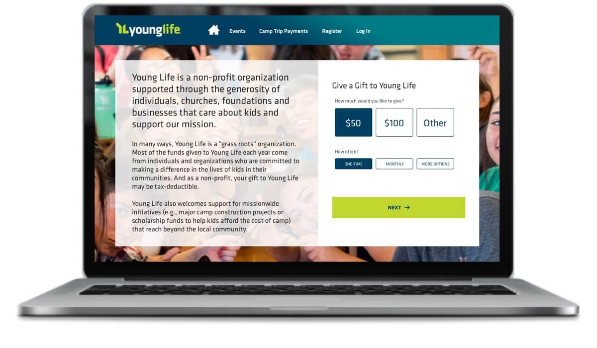
- Be responsive and work on any device
- Use existing branding for a seamless experience when accessed from their website
- Allow donors to:
- Set their donation as one-time or recurring
- Donate as a person or an organization
- Donate anonymously if desired
- Easily search, filter, and choose from multiple designations for where the money goes
- Dedicate the donation in honor of a person or event
- Receive a custom link for a pre-designated recipient or campaign that coordinates with a fundraiser or event, but still be able to make edits
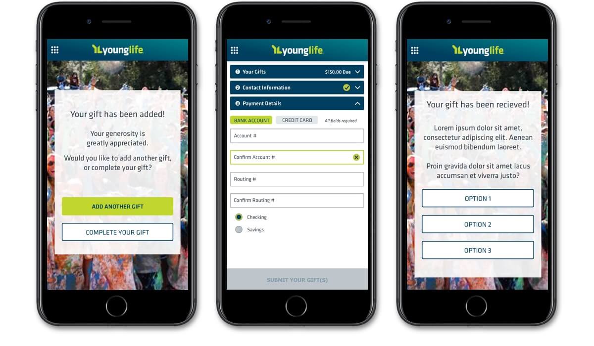
- Add multiple types of donations to one transaction
- Edit donations from the summary screen
- Have the option of creating an account at checkout
- View multiple options after completion of transaction, including social media sharing, go to your new account/take new member tour, view other campaigns of interest
- Allow admins to:
- Edit all copy on donation form and confirmation screens
- Generate custom, sharable links with pre-designated amounts and recipients
- Update payment options
- Create additional versions for A/B testing
Role, Process, Who I Worked With
As design lead, I owned both UX and visual design activities and deliverables. I worked with our technical architect, project manager, account director, and developer to strategize and deliver a quality product despite scope creep and somewhat ambiguous requirements. Together we coordinated with our stakeholders, who consisted of their project manager, head of marketing, VP of International Development & Strategic Initiatives, and several others who oversee giving and finance at Young Life.
Since we were repurposing an already-approved budget that was intended for a completely different effort, I enforced strict boundaries and definitions around design scope. I had exactly 90 hours to work with, not a single hour more. I used a visual UX/UI calendar to convey how much effort would go into each day and week leading up to review sessions, feedback, and sign-offs. This made it easier to rationalize to my client why we would not be seeing multiple designs, and why we all needed to adhere to the due dates I set for each activity.
Key activities:
- Set up a Google doc for UX and UI collab across the project team (links to wireframes, branding, UI kit, source files, etc.)
- Facilitated a user journey flow session with our clients to ensure we'd accounted for every scenario and requirement, and then distilled a long list of wants into an MVP-friendly set of user stories
- Deployed a mobile-first strategy for wireframes and visual design, keeping desktop designs to a minimum
- Designed all wireframes, visual designs, and UI Kit for handoff to developers
- Facilitated collab design sessions with my immediate project team and then review sessions with our client team
The Result
Young Life was thrilled with the outcome of the new form, and that we fit everything into the timeline and budget. At last status update, there were still some Salesforce integrations taking place, and an additional phase being added to the project to support the remaining work needed to complete the Community. As of early 2019, the original Giving Form is still live.
In Retrospect
My visual UX/UI calendar came through again! It gave others on my team who were new to the UX design process a better sense of scope.
Tools Used
- Axure RP 8
- Sketch
- InVision